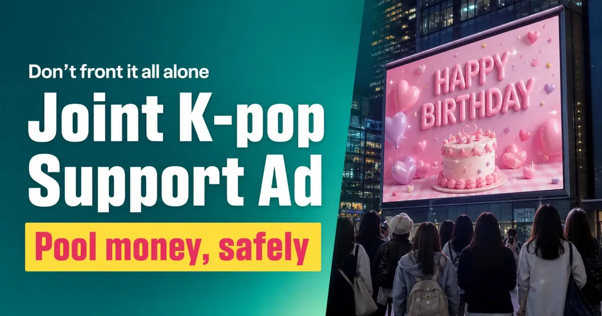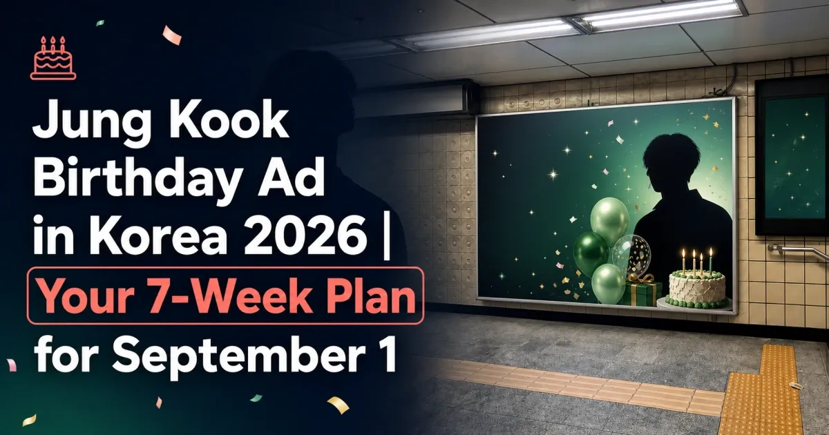
Picture your bias's name lighting up a screen in a Seoul subway station on their birthday. Fans stop, take photos, tag it everywhere. It's a beautiful moment — and then comes the quiet panic: wait… who actually designs that image?
If you've never made an ad before, this is the part that feels most intimidating. Good news: you don't need to be a designer. You just need to know what goes on the artwork, how to make it readable, and what each medium needs. Let's walk through it together — you've got this.
What actually goes on a support ad
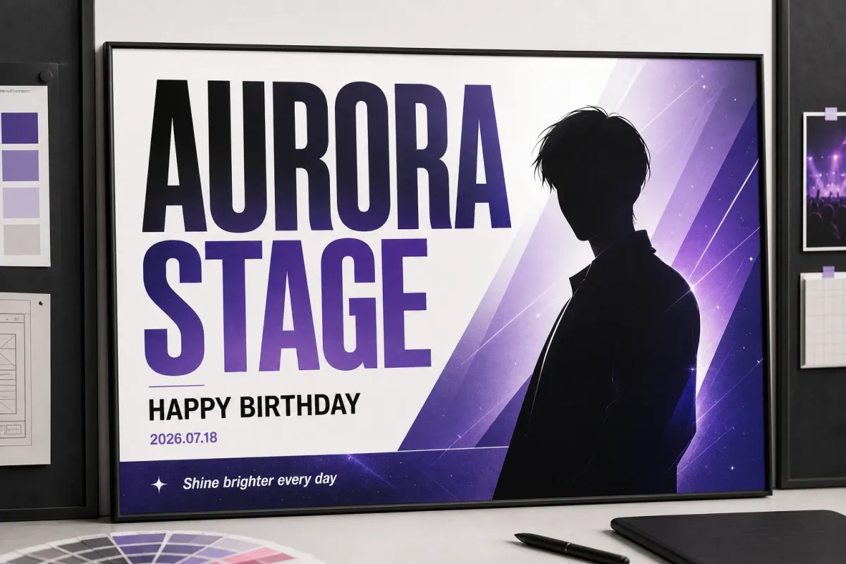
A support ad isn't a poster crammed with everything you love. It's a few key pieces of information, arranged so people read them in order — fast. Think of it as a hierarchy: the most important thing is the biggest, and everything else supports it.
Make it readable in 3 seconds
Here's the test: if someone walking past can't get the message in about three seconds, there's too much on it. Designing an outdoor ad is mostly about deciding what to leave out.
- One main line, ~7 words max. A long sentence on two lines won't land.
- Make the name about twice the size of the small details — let the hierarchy do the work.
- High contrast. Dark on light, or light on dark. Pastel-on-pastel disappears from a distance.
- Bold sans-serif fonts. Script and thin fonts blur the moment you step back.
- Leave breathing room. White space pulls the eye to what matters; a packed layout reads as noise.
- The 1:10 rule of thumb: roughly 1 inch of letter height for every 10 feet (≈3 m) of viewing distance.
- Name large and first
- One warm line of message
- High-contrast colors
- Plenty of empty space
- A paragraph of message
- Everything the same size
- Pale text on a pale photo
- Five hashtags crammed in
Every medium wants a different file
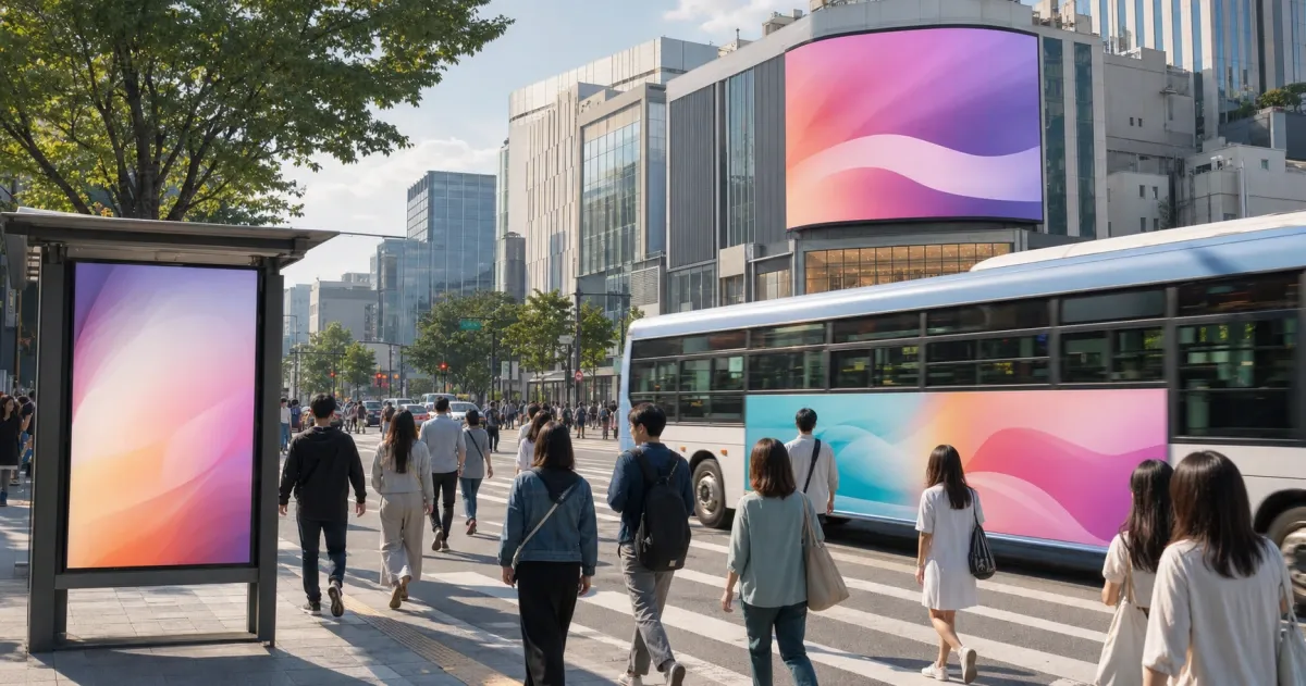
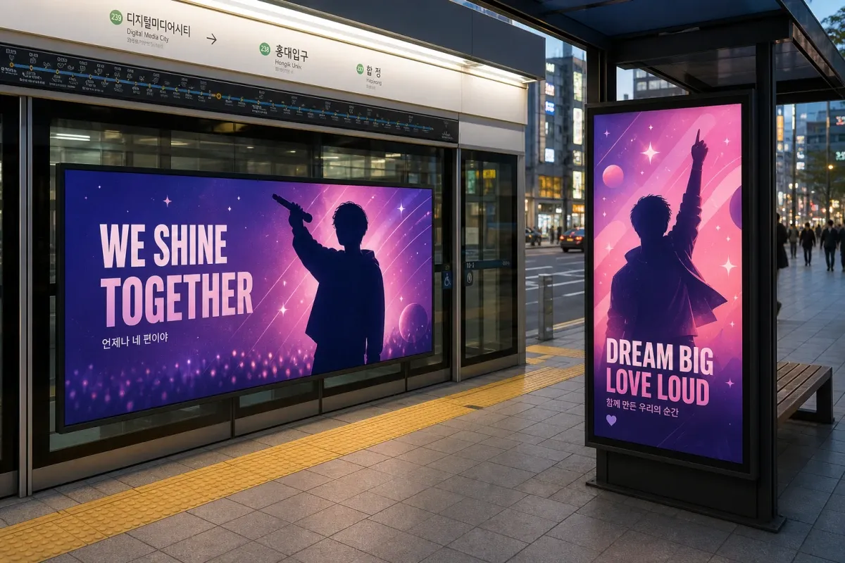
This is where first-timers trip up. A subway door, a digital billboard and a bus wrap don't take the same file — they differ in shape, color mode and format. Here's the lay of the land:
| Medium | Orientation | Color mode | Typical file |
|---|---|---|---|
| Subway screen-door / station | Mostly landscape | CMYK (print) | PDF / AI, fonts outlined |
| Digital billboard / signage | Landscape (some portrait) | RGB | jpg / png, matched to panel pixels |
| Bus wrap (side) | Long landscape band | CMYK | AI / PSD, fonts outlined |
| Bus-stop shelter | Portrait lightbox | CMYK | PDF / AI |
| Banner | Mostly landscape | CMYK |
Still image or video? Most support ads are still images, so a single well-made graphic covers the great majority of spots. A few digital screens — like apartment-elevator displays — are built to run video, so check whether your specific spot needs a moving file before you start.
Stay on the safe side: rights
The fun part is the design. The part that protects you is the rights behind every image, font and logo you place. None of this is meant to scare you — it's just the homework that keeps your celebration clean.
- Photos. Official photos belong to the agency; fan-taken shots belong to the fan who took them. "Publicly posted" doesn't mean "free to use" — get permission or use rights-cleared images.
- Logos, album art, characters. These are separate rights — don't drop them in without checking.
- Fonts. "Free" doesn't always mean "free for commercial or outdoor use." Read the license; OFL fonts are usually a safe bet.
- Agency & IP guidelines. Some agencies and IPs publish their own support-ad rules — read those first.
- Outdoor placement. In Korea, outdoor ads have permit, sizing and review steps; a good local platform handles or checks that part for you.
☐ Fonts licensed for commercial use
☐ No official logos or album art without clearance
☐ Checked the agency / IP support-ad guidelines
Design it yourself — or hand it over
You've got two honest options, and neither one is "wrong."
Do it yourself
Start in Canva — it's the easiest entry point, with templates, free elements and size presets, right in your browser. It's perfect for laying out your text over a simple background. When you need print-ready files for outdoor media, move up to Illustrator or Photoshop (vector files scale up without blurring). Many first-timers start in Canva and only graduate to the pro tools when a medium demands it.
☐ High resolution — no tiny web images
☐ Fonts outlined, images embedded
☐ Nothing important in the trim / safe zone
☐ Spelling, dates and romanization double-checked
☐ Built to the medium's exact spec
Let someone handle it
Short on time, not confident with the tools, or stuck on specs and review? A design service can build the artwork for you. At DUKPLACE, support-ad artwork starts from about 200,000 KRW (still images — photo and graphic work). Think of it as the "I don't want to risk a rejected file" option for a first-time organizer who's juggling a fixed birthday deadline. (If a spot specifically needs video, that's a separate production.)
Ready when you are
Designing your first support ad feels huge right up until you break it into pieces: say the right things, make them readable, build to the spec, keep the rights clean. Do that, and your bias gets a moment that's done right — and you get the photo you'll keep forever.
Browse subway, billboard, bus and banner spots across Korea — local and direct, so you see real prices.